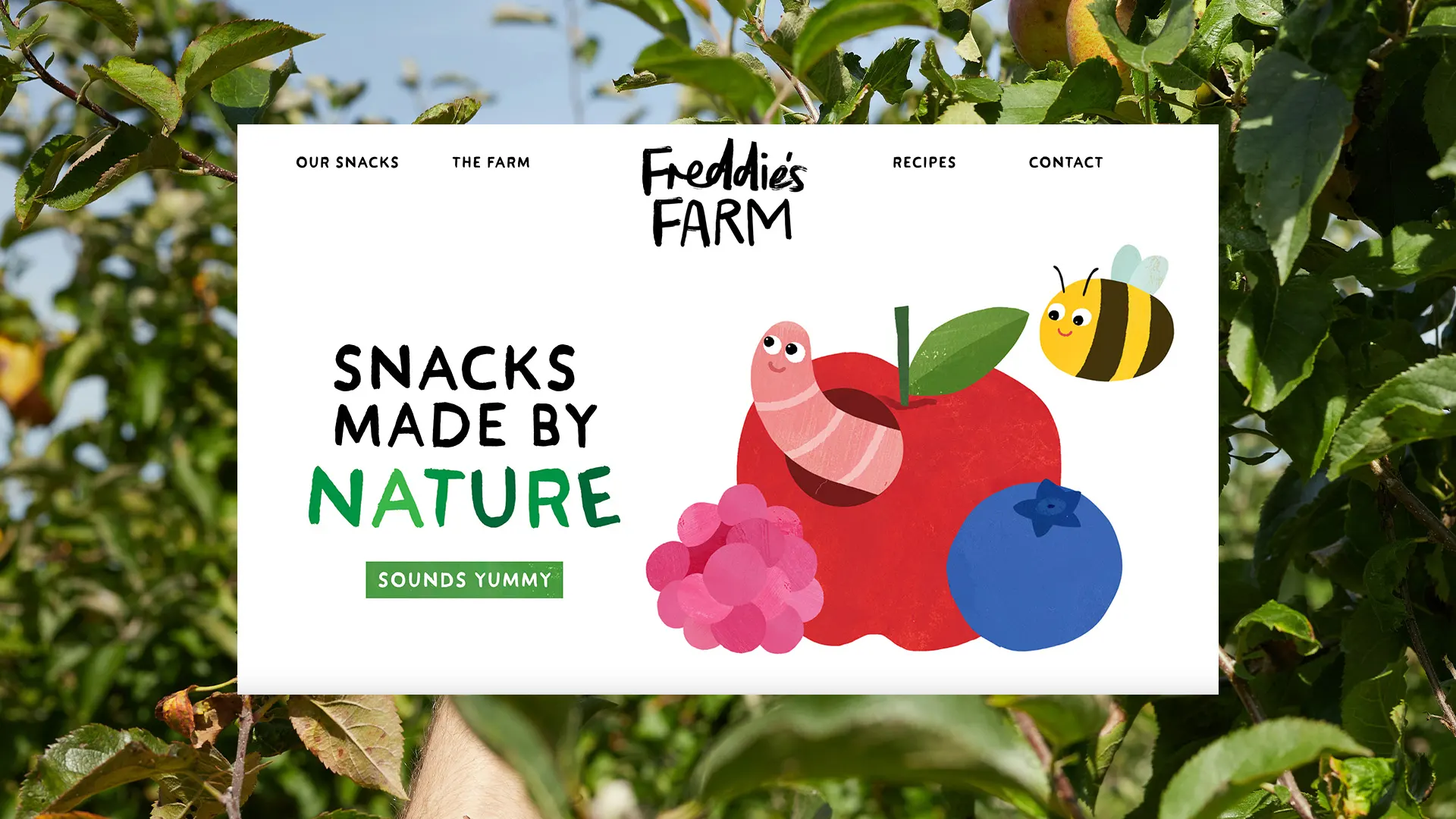
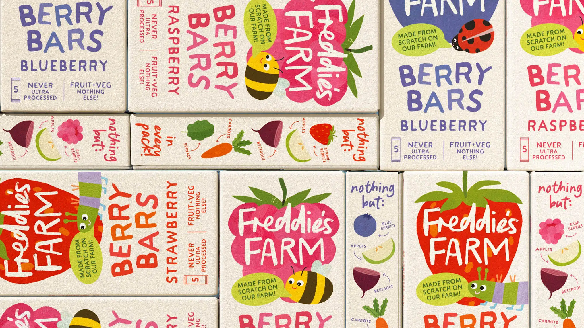
Freddie's Farm
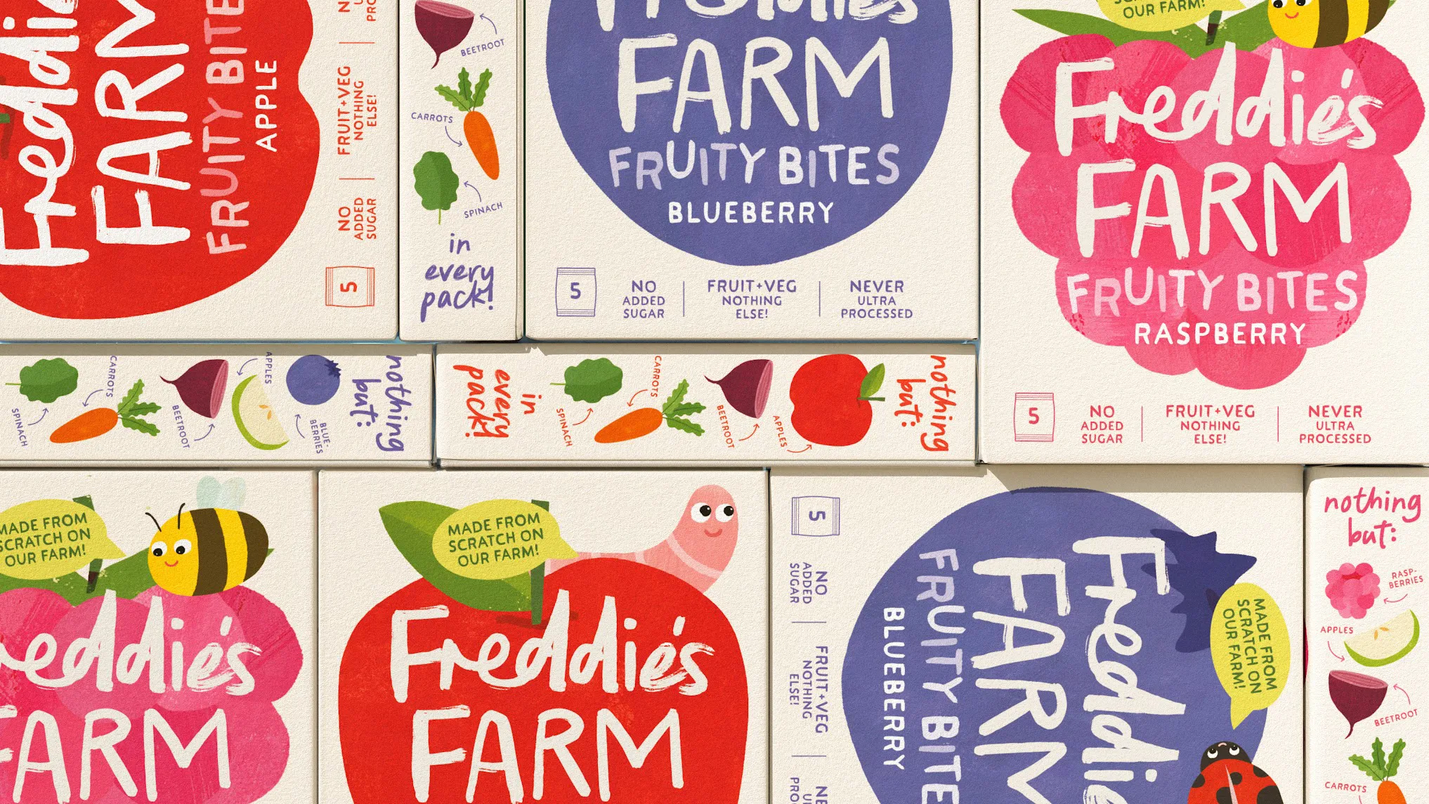
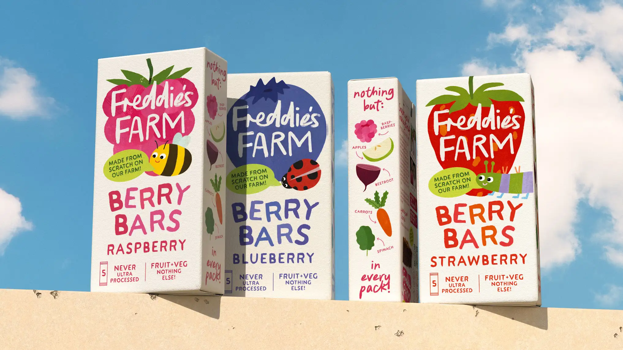
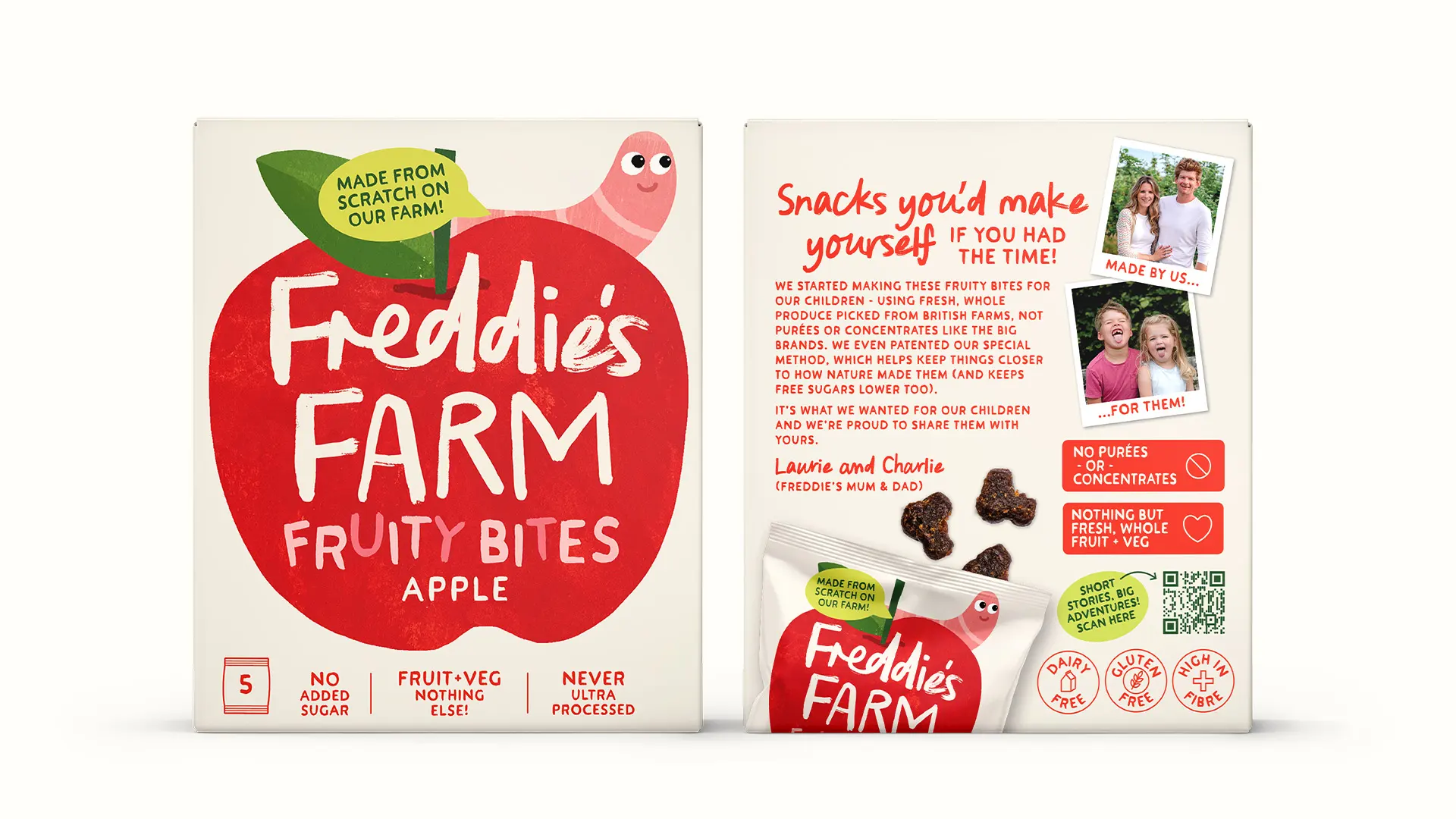
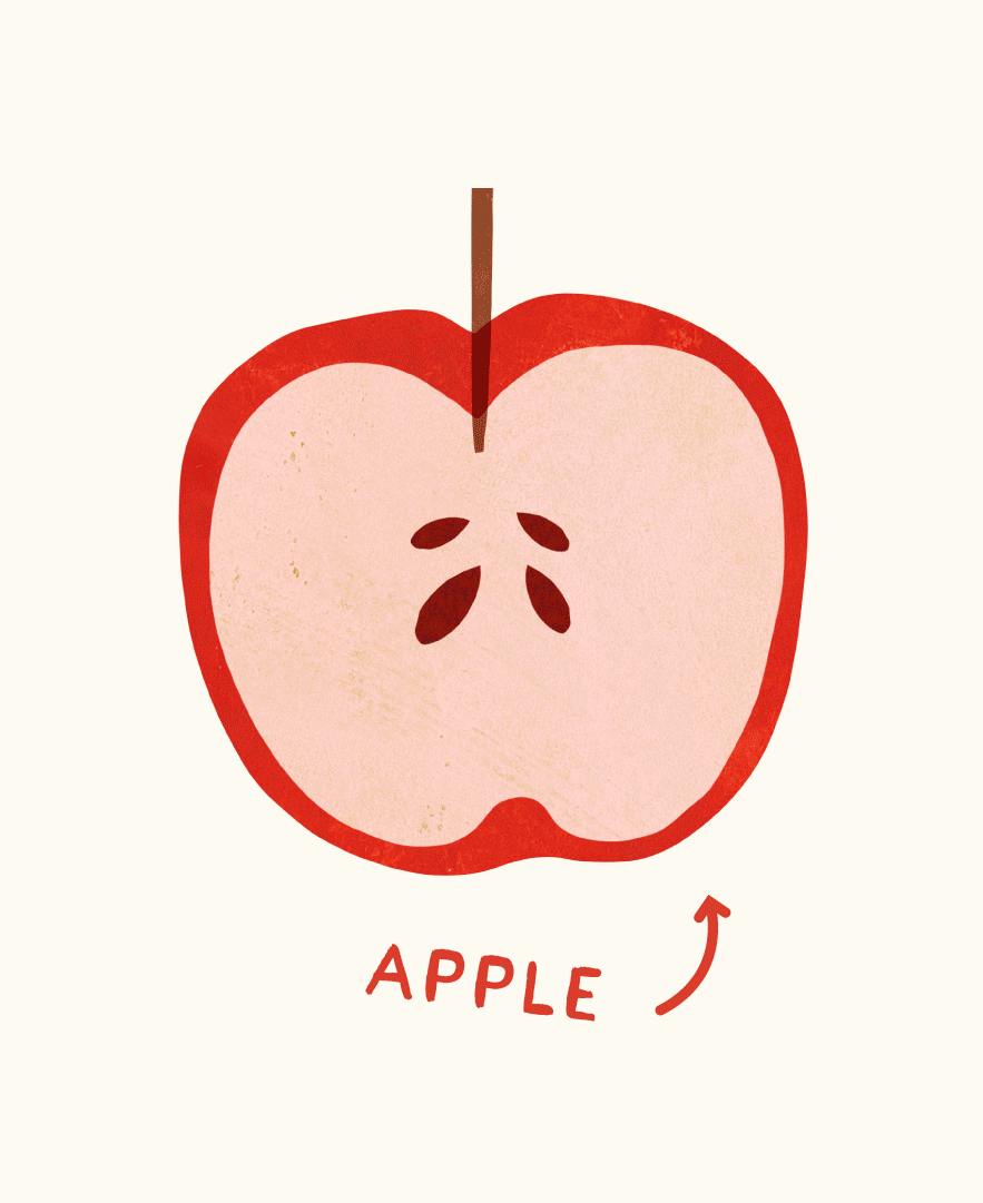
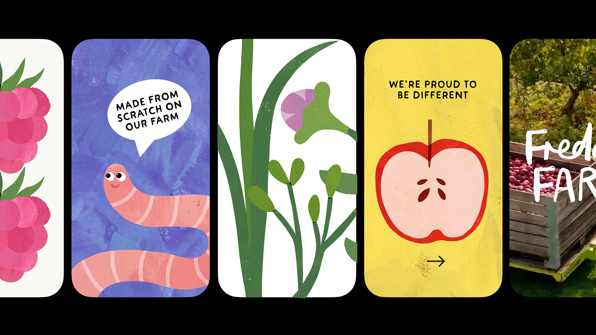
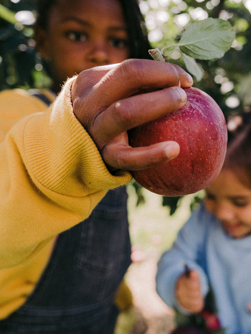
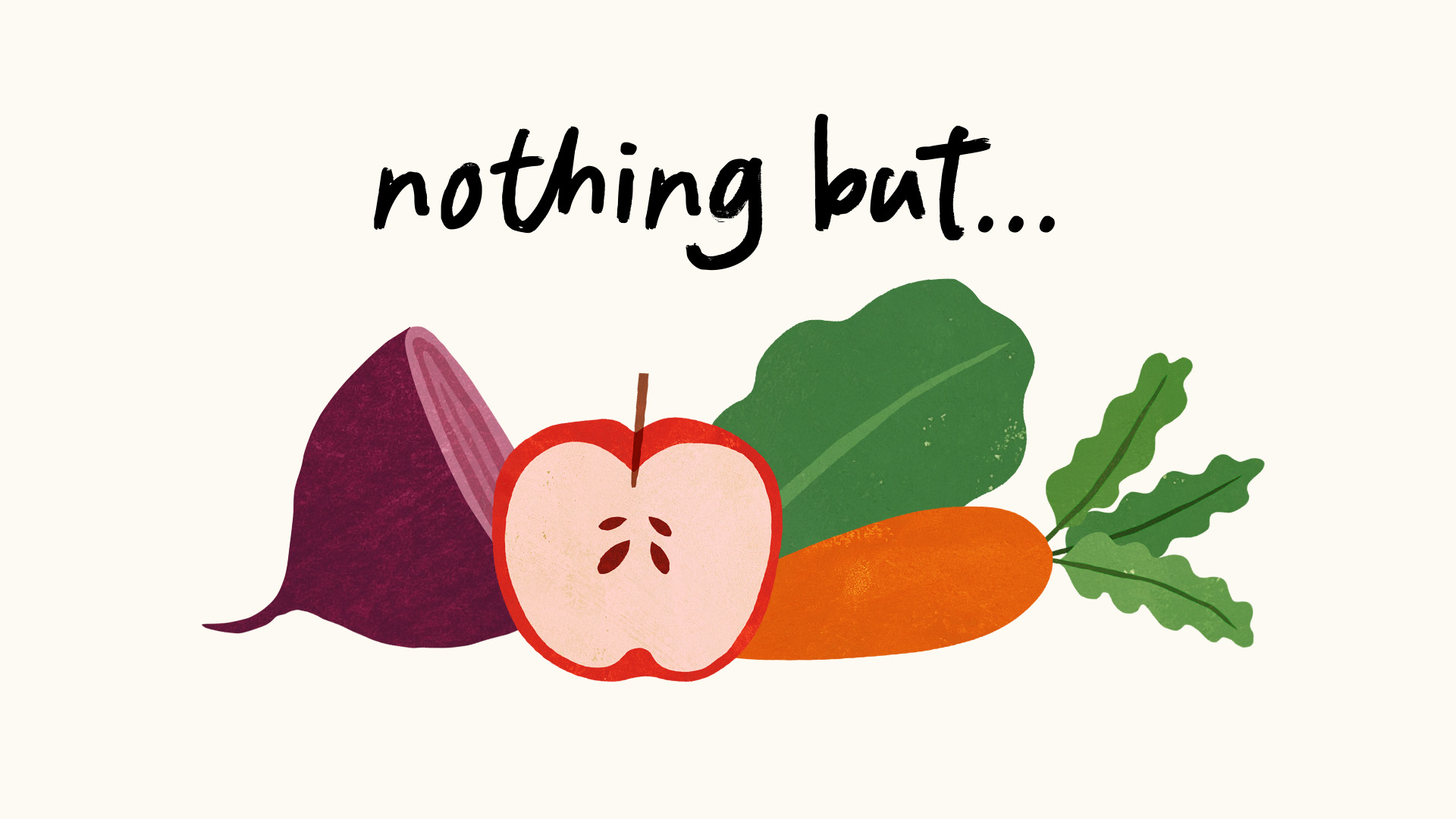
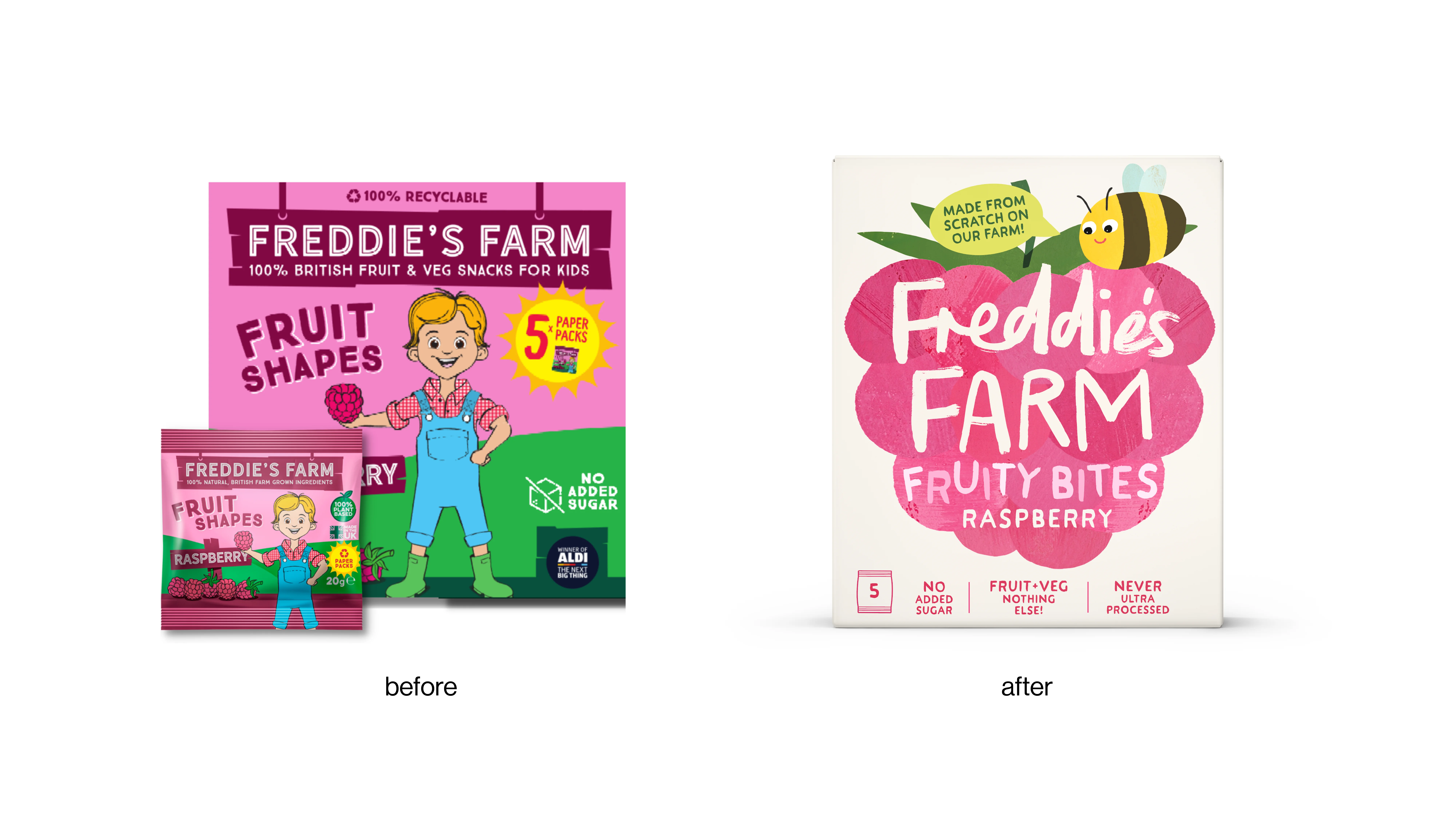
Freddie’s Farm has been reimagined with a hand crafted storybook identity that brings its fourth-generation Kent farm to life. In a category awash with bright cartoons and vague health claims, the brand stands firmly on what sets it apart: unprocessed, whole fruit and veg, made from scratch on the family farm.
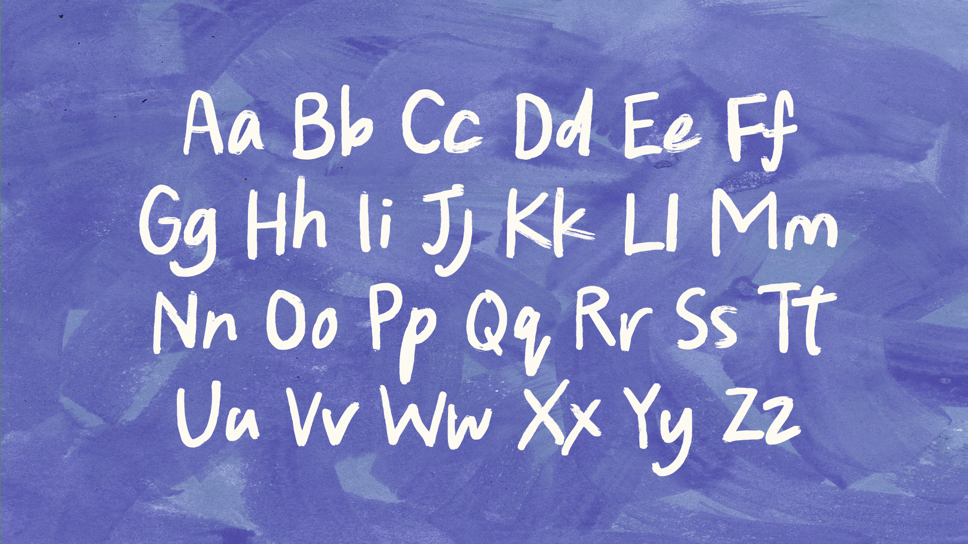
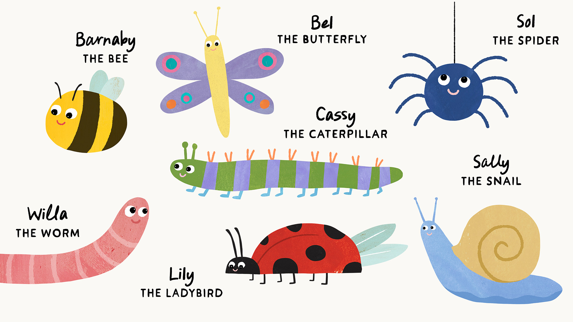
The new look taps into the magical world Freddie sees around him, the bees, bugs and butterfly’s are the heroes of the farm, as bio diversity is celebrated. Brought to life as charming characters that could have come straight from a children's book, with hand-drawn illustrations of ingredients, a softened handwritten logo and a fresh, vibrant colour
palette.
The result is a naturally crafted brand world that reconnects kids with where their food really comes from. Transparent, tasty and imaginative in equal measure.